
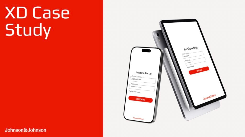
Project Overview and Mission
Over the course of 5 months, I worked alongside a team of five MBS students at Rutgers University for Johnson & Johnson to evaluate and redesign their Aviation Portal. At Johnson & Johnson, the Aviation Portal is used for pilots, dispatch and aircraft maintenance personnel to track fuel prices, submit flight logs, and book overnight accommodations at J&J’s hangar facilities. Upon starting the project, the main goal was clear: find out why the Aviation Portal wasn’t favored amongst its users, and determine what an updated solution for its users might look like.
Aviation Portal Redesign Timeline at a Glance
Project Mission & Product Surveillance
J&J’s Aviation Portal had low user engagement, poor information architecture, and high dissatisfaction amongst users. Our goal? Determine how to improve user satisfaction and increase platform usability.
Market Research & User Testing
Through heuristic testing our team was able to determine the core issues behind J&J’s Aviation Portal. User testing amongst pilots, aircraft technicians and dispatch personnel revealed a misalignment between the portal’s purpose and its functionality.
Portal Redesign
A redesign of the Aviation Portal became the priority for Johnson & Johnson. Our team created high fidelity wireframes using Figma to demonstrate the potential of the Aviation Portal.
Portal Redesign User Test
The updated version of the Aviation Portal was tested amongst J&J pilots, dispatchers and aircraft maintenance personnel to capture user feedback of the portal’s aesthetics and function.
Redesign Delivery & Conclusion
User feedback of the redesign was overwhelmingly positive. Ease of task completion was rated at maximum value for nearly all use cases, finally matching the platform for user workflows.
Product Surveillance and User Testing
The first step on our mission to improve the Aviation Portal was to conduct a critical analysis of the product including a heuristic evaluation to gather a baseline of the current usability issues. This evaluation revealed fair labeling but poor information architecture and poor navigation, resulting in a disjointed and incoherent user experience. To dig deeper into these issues, Johnson & Johnson’s Aviation Department was asked to complete a survey about their experiences within the Aviation Portal. Most users reported poor organization and a high difficulty navigating through the portal to find the information they needed, citing poor document management and outdated forms clogging workflows.

In conjunction with the survey results, user interviews were conducted by the MBS team to gather contextual insights and better understand the nuances of the Aviation Portal’s use cases. These interviews helped guide our team in building the bigger picture behind the Aviation Portal, to build user context, inform personas and nail down pain points and barriers to usage. These interviews revealed most users found the current portal to be largely irrelevant to their daily workflows, and cumbersome to rely on without mobile portal support. Frequently outdated information violated the users’ trust in the platform.
Product Redesign
In order to improve the Aviation Portal’s functionality and visual design, two prototypes were created on Figma as high fidelity wireframes. Through these wireframes the aviation department could interact with each product to determine usability. Both prototypes were created with respect to three principle user personas: the pilot, the dispatcher and aircraft maintenance personnel. For each of these roles, different functionalities and workflows were needed within the Aviation Portal. Prototype One presented as an updated and modernized variation of the current design to connect with users’ familiarity while incorporating the desired improved task management elements.
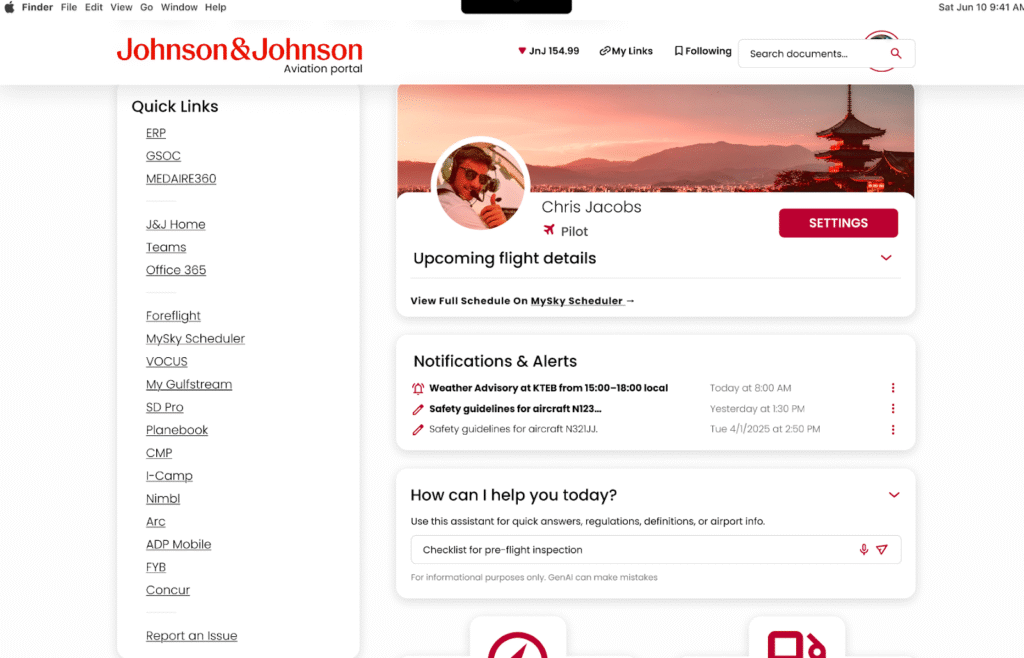
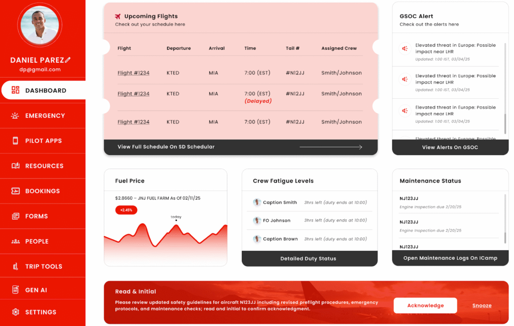
Prototype Two utilized a completely new design, ensuring to respect J&J’s color, font and iconography schematics while allowing users to experience what a vastly different portal could feel like visually. Both prototypes embraced a card centric design, offering users an organized, intuitive and responsive platform.
User Testing of Redesign & Conclusions
A secondary round of user testing was conducted once the Aviation Portal redesign was complete. The MBS team interviewed members of the Johnson & Johnson aviation department measuring rates of task completion and aesthetic impressions for two proposed versions of the Aviation Portal. During the prototype test, users were asked to evaluate initial impressions and perceived intuitiveness before complete 8 micro tasks and 2 workflow simulations designed to reflect day to day activities. After completing initial impressions, micro tasks and workflow simulations, users were asked what they found most valuable about the redesign and what features could be missing.
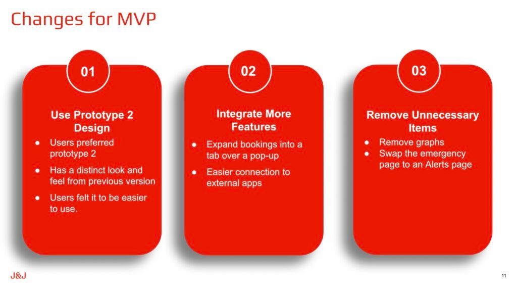
After analyzing the data received from user testing, Prototype Two was determined to be the preferred design, based on higher aesthetic evaluations from users for its clean, polished and thematic design, as well as being more intuitive and user friendly in attempts to navigate the app and find necessary information. Based on what was gleaned from users in their testing sessions, a series of design recommendations improving upon Prototype Two was suggested to Johnson & Johnson for their Minimum Viable Product.