
Project Overview and Mission
Created as part of a rigorous bootcamp style curriculum in Rutgers Intro to UXD course in the fall of 2024, Scarlet Space is a digital product developed as a solution to the mission: “Help Rutgers University build a future where collaboration and empathy thrive”
User Interviews
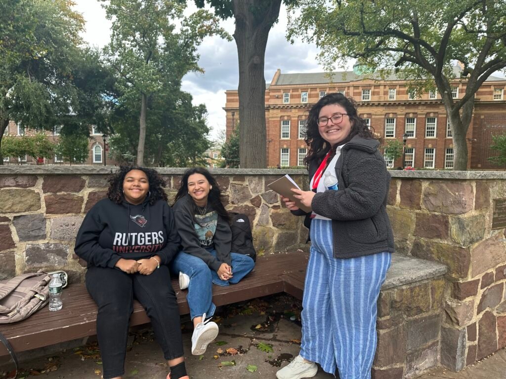
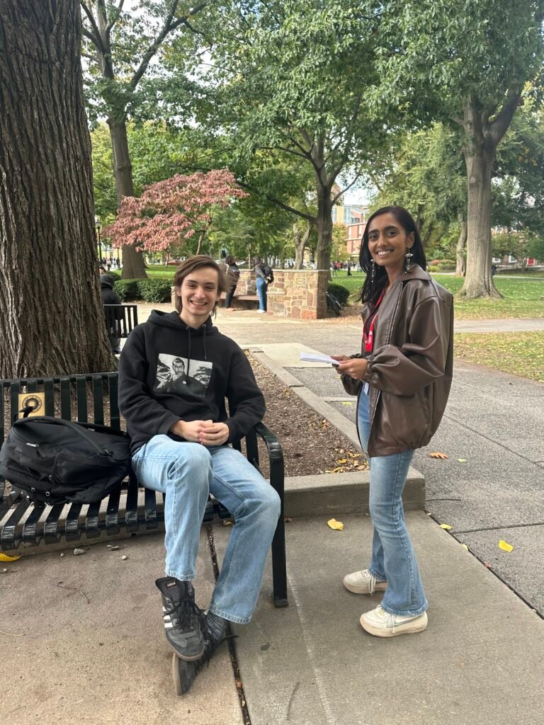
Our primary step to learn more about student needs and feelings of connection and collaboration on campus was to conduct user interviews. Over the course of one hour, our group interviewed 20 students about their experiences making friends, finding ways to express their interests and participate in hobbies, and getting academic support. What we discovered was that the majority of students we interviewed met friends through attending clubs or studying with classmates. Students found academic support in using the Rutgers Learning Centers and studying with classmates, but expressed hesitation about where to find information about study groups, as well as insecurities in making the first move to ask fellow students to study together.
In regard to their social health, many students relied on Instagram to stay updated on campus programming and discover clubs and organizations centered around their interests, a discovery that surprised our design team in its popularity. Keeping these findings in mind, it was time to move onto data analysis and product design. What could a solution look like that would help students find friends, get academic support and discover extracurricular activities that they would enjoy?
Brainstorming and Product Design
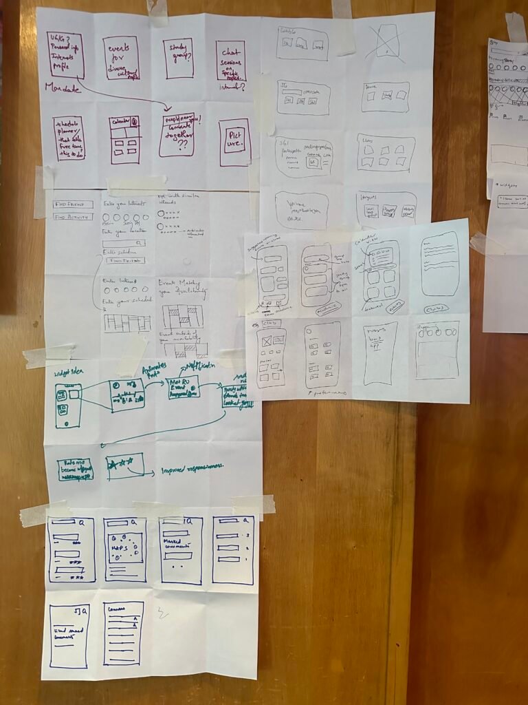
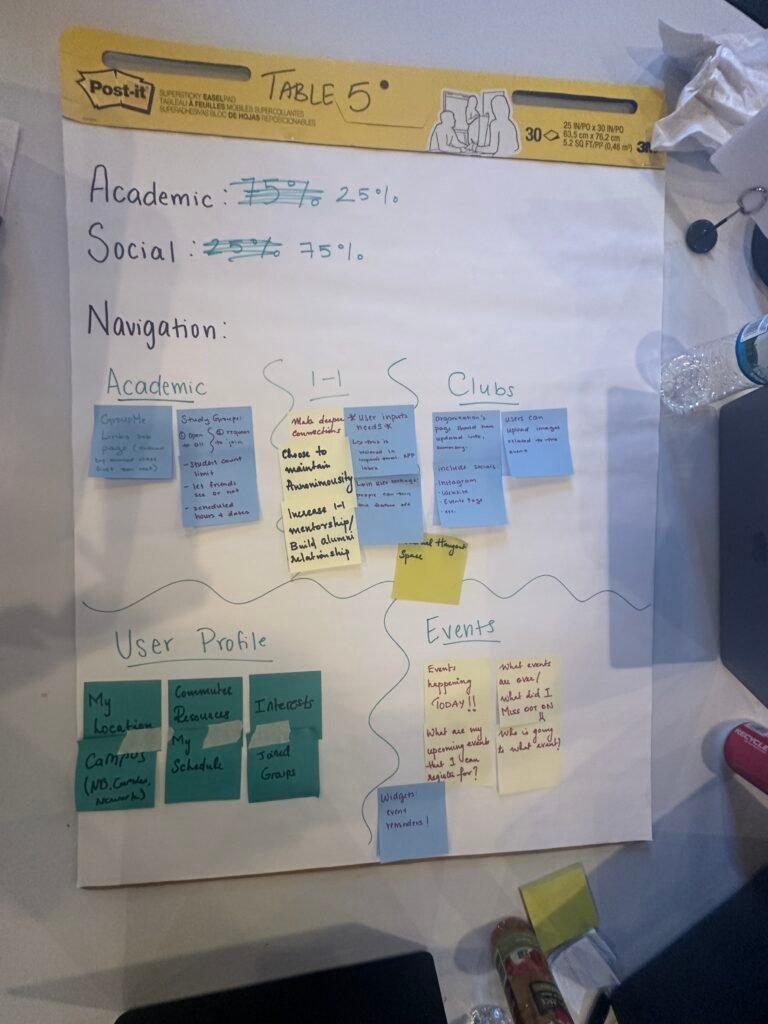
In order to build our skills of design thinking, student designers were guided through a series of industry standard brainstorming practices: persona development, journey maps, empathy maps, affinity maps and five minute sketches. This process helped us isolate user needs, behaviors, thoughts, pain points and user journey flows. We used the organizational infrastructure provided by our curriculum instructors to create a design plan aligned with UX Laws, to make a product that would be aesthetically pleasing (Aesthetic-Usability Effect), intuitive (Cognitive Load), and enjoyable to interact with (Flow). These insights informed our design decisions when building Scarlet Space.
Wireframes & Prototyping
Keeping in mind user insights and design requirements, Group Six proceeded to embark on their prototyping journey. In order to make our design come to life, we used Figma to create a series of high fidelity wireframes to embody the digital product we named ScarletSpace, aptly themed to match Rutgers’ official school colors, scarlet red and black. As an official Rutgers affiliate app, students would be assigned a unique profile and log in information linked to their student email and Net ID password.
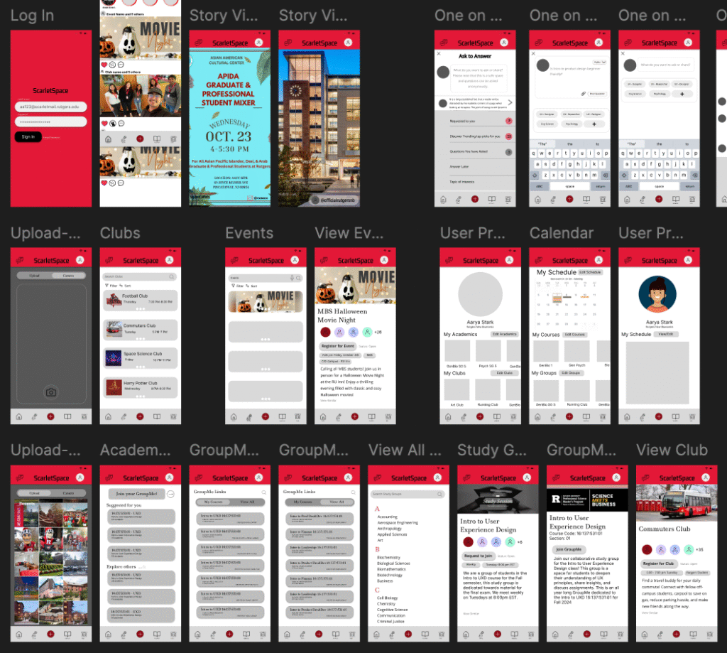
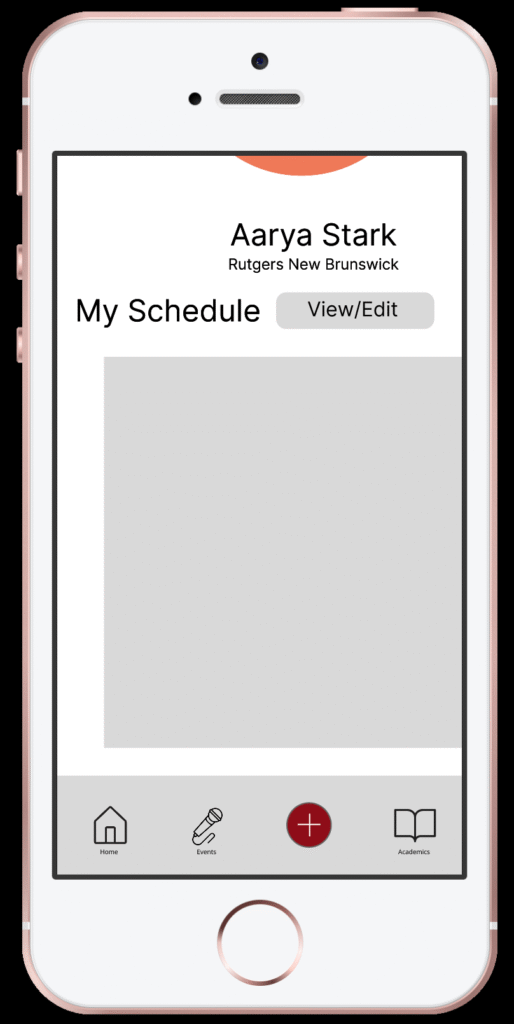
ScarletSpace was intended to act as an official university app for users to find clubs and student organizations, get live updates from friends and clubs about programming, track their academic and personal scheduling, and join study groups based on their personal schedule which could be uploaded to the app.
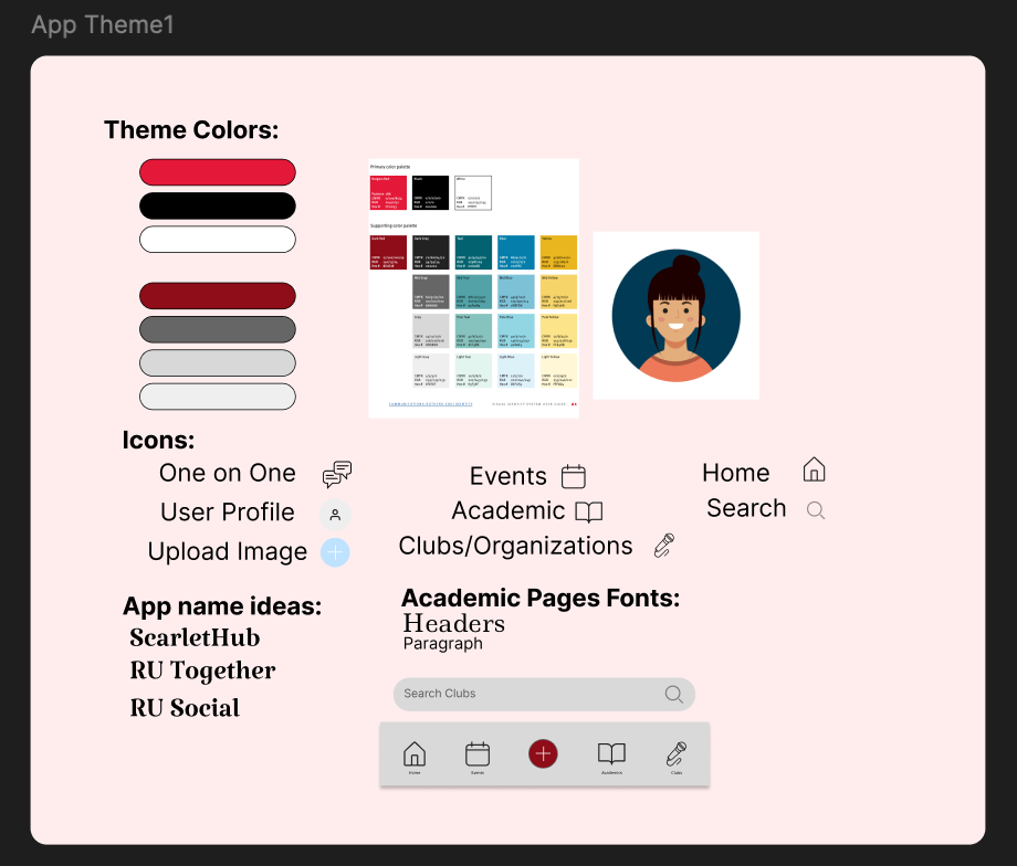
In order to ensure our design maintained consistency throughout its many pages, our group utilized a design panel within Figma to save all of our fonts, semiotics, and color theme.
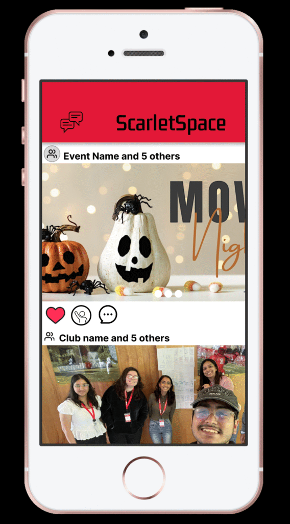
Our prototype was designed with industry standard UX principles in mind. Scarlet Space’s design and functionality is meant to be intuitive and recognizable to our audience, embodying Jakob’s Law by resembling similar social apps like Instagram and Reddit. The ScarletSpace Home Page presents users with a scrollable feed of posts and stories from accounts they choose to follow, to receive live updates from groups they want to interact with. Other pages can be located through a navigation bar located at the base of each page. This information architecture is built with Selective Attention and Cognitive Load in mind, to ease the burden of navigation on the user.
Preview the prototype on Figma here:
User Testing & Feedback
In order to assess the viability of our product, we hosted six Rutgers students as test users. Each user was evaluated interacting with the app for ten minutes per session. Users were given 2 minutes at the beginning of each session to freely explore through the app and note thoughts on the app’s purpose and design. Most users felt that they liked the overall design of the app, however some were confused about the app’s purpose upon initial exploration. Some notes on information architecture such as the location of certain items like the user calendar were given to be amended in a future version of the product. The most agreed upon feature to be changed significantly or removed entirely was the app’s 1:1 chat function, which the majority of users did not feel was necessary nor did they understand how to utilize it.